©Copyright 2024. Acosta Design Lab. All rights reserved.
The design project for “Pechino Express” aimed to create an engaging and recognizable visual identity for the television show.
The goal was to convey a sense of adventure, the discovery of diverse cultures, and competition through travels in exotic and challenging territories. The design had to capture the essence of the journey and the personal growth that comes from it, as well as the dynamics of the competition. The concept needed to be flexible, to fit a variety of media applications, from television screens to printed and digital materials. Additionally, the visual identity had to be scalable, to maintain its effectiveness in both large and small formats. It was essential that the design was distinctive enough to differentiate from competing programs while staying true to the visual language of the “Pechino Express” brand.
In the exploration phase, the team played with various graphic elements that could embody the spirit of the program. It started with the creation of a logo inspired by a compass, a symbol of travel and orientation, around which the entire visual identity was built. The use of radiant lines from the center evokes movement and speed, while the choice of warm colors like yellow and red reflects energy and passion. During the construction of the identity, each element was carefully considered for its meaning and visual impact. The design integrated ancient maps and route patterns to emphasize the theme of exploration. The contrast between warm colors and the freshness of modern geometric design also played a key role in the program’s identity.
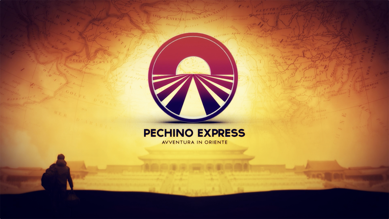
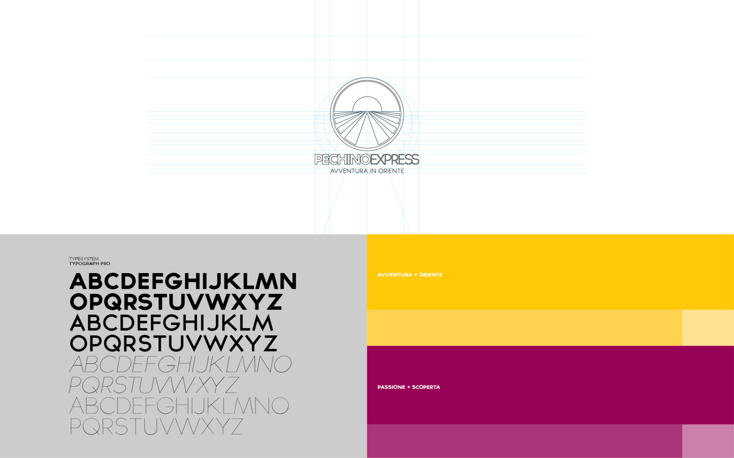
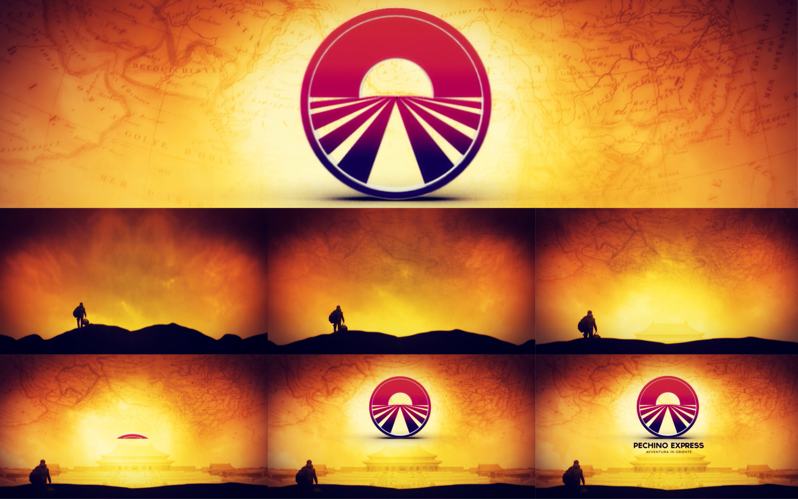
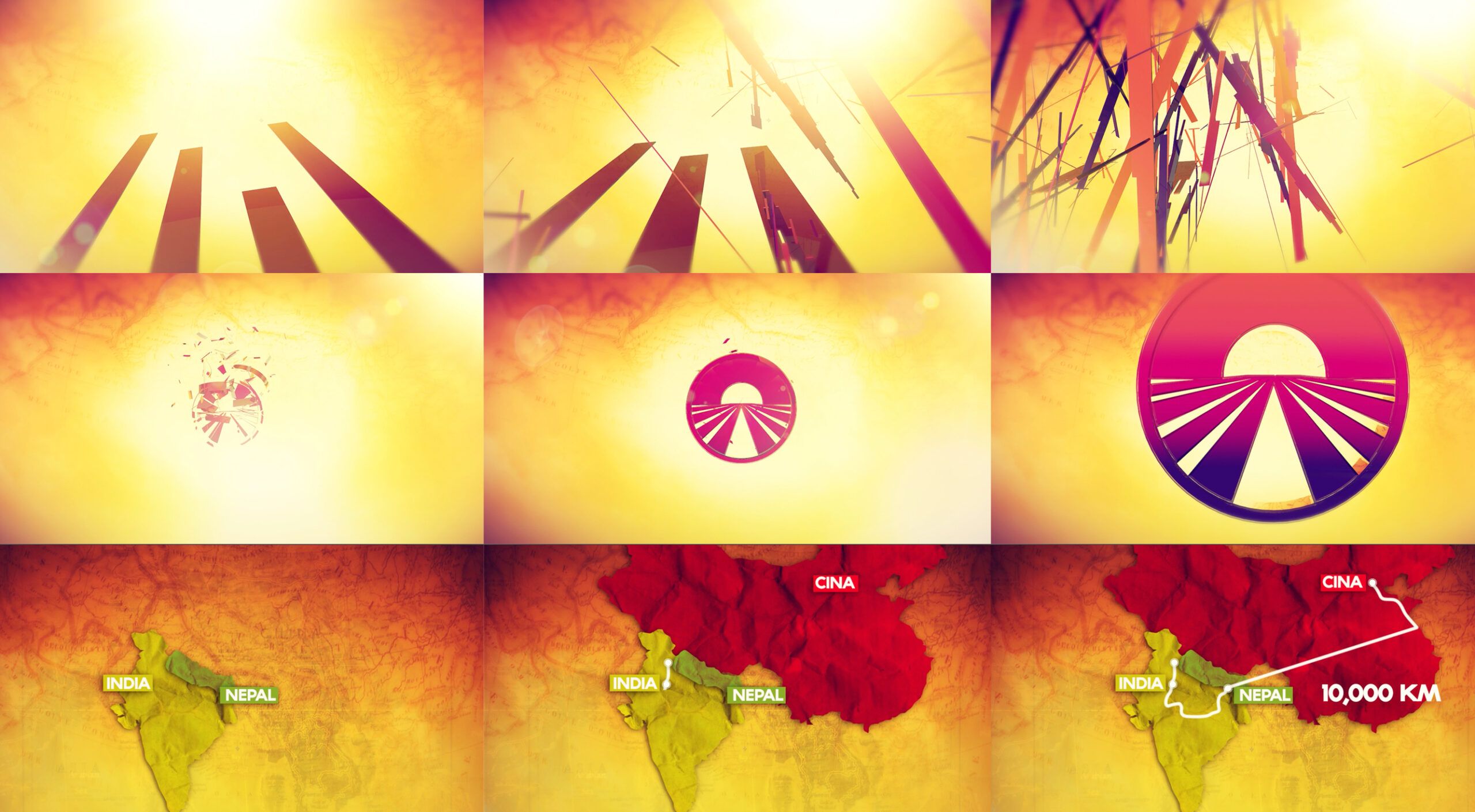
The visual language was built on a palette of vivid colors, bold geometries, and iconographic references to travel and discovery. The main colors were a golden yellow that calls to mind adventure and enthusiasm, and shades of red and pink that suggest passion and discovery. These colors are combined with textures that recall ancient maps and routes, establishing a connection between the past and the present.
The geometric shapes used in the design provide a sense of direction and movement, essential for a program that revolves around travel and competition. The logo, which is both a compass and a rising sun, reflects optimism and new beginnings, core elements of the “Pechino Express” experience.
©Copyright 2024. Acosta Design Lab. All rights reserved.