The Lega A5 rebranding project embarked on a strategic overhaul of the league’s brand identity to elevate its international presence and appeal. The project was tasked with transforming the league’s visual identity to resonate with a broader global audience, while retaining its strong Italian football roots. Objectives of the project encompassed: crafting a versatile and dynamic brand identity that aligns with the speed and agility of 5-a-side football; developing a visual language that transcends cultural barriers, making the league recognizable and appealing internationally. Positioning Lega A5 as a premier organization within the global 5-a-side football community and ensuring that the new branding would be adaptable across various media and marketing platforms, from digital to physical merchandise.
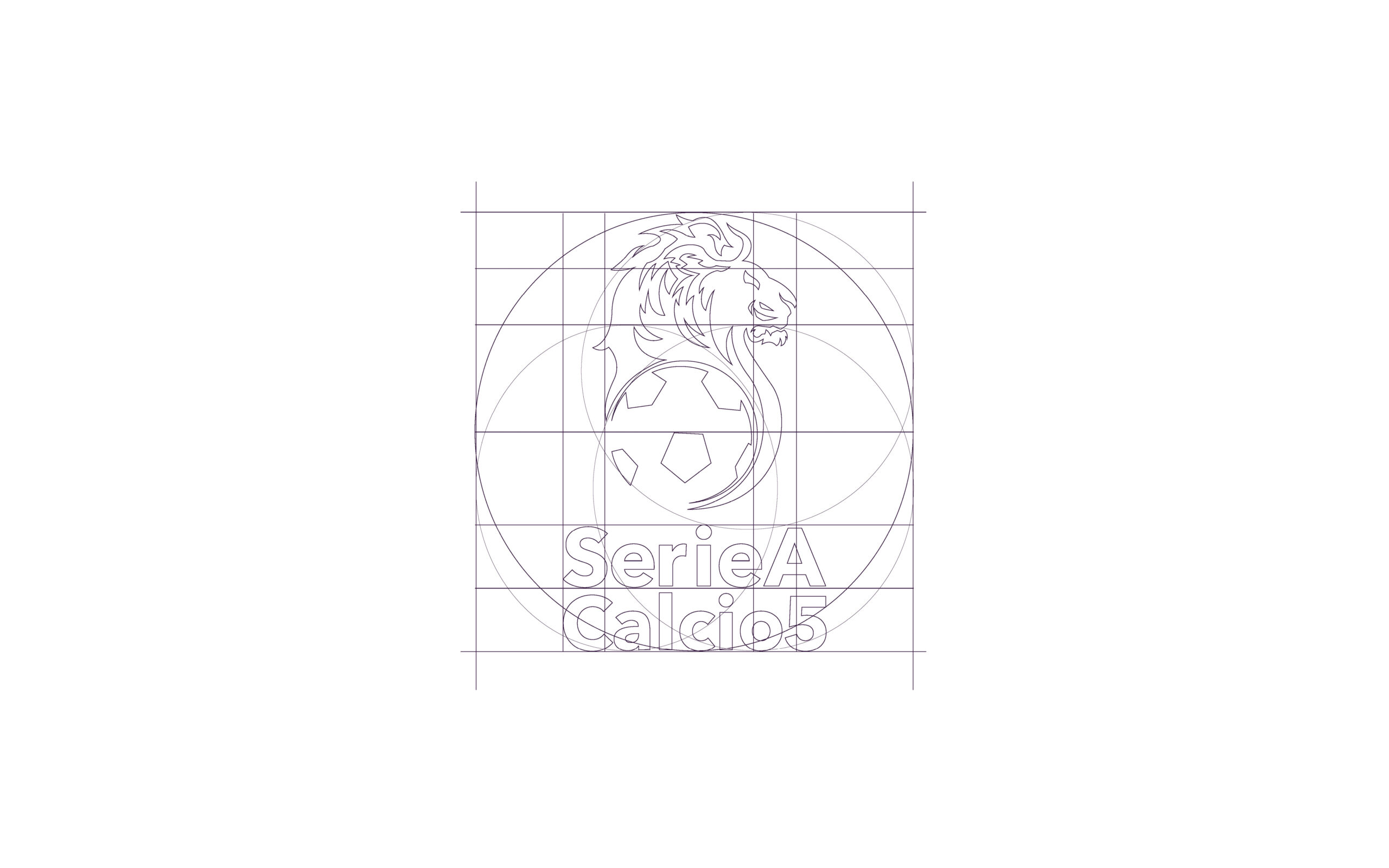
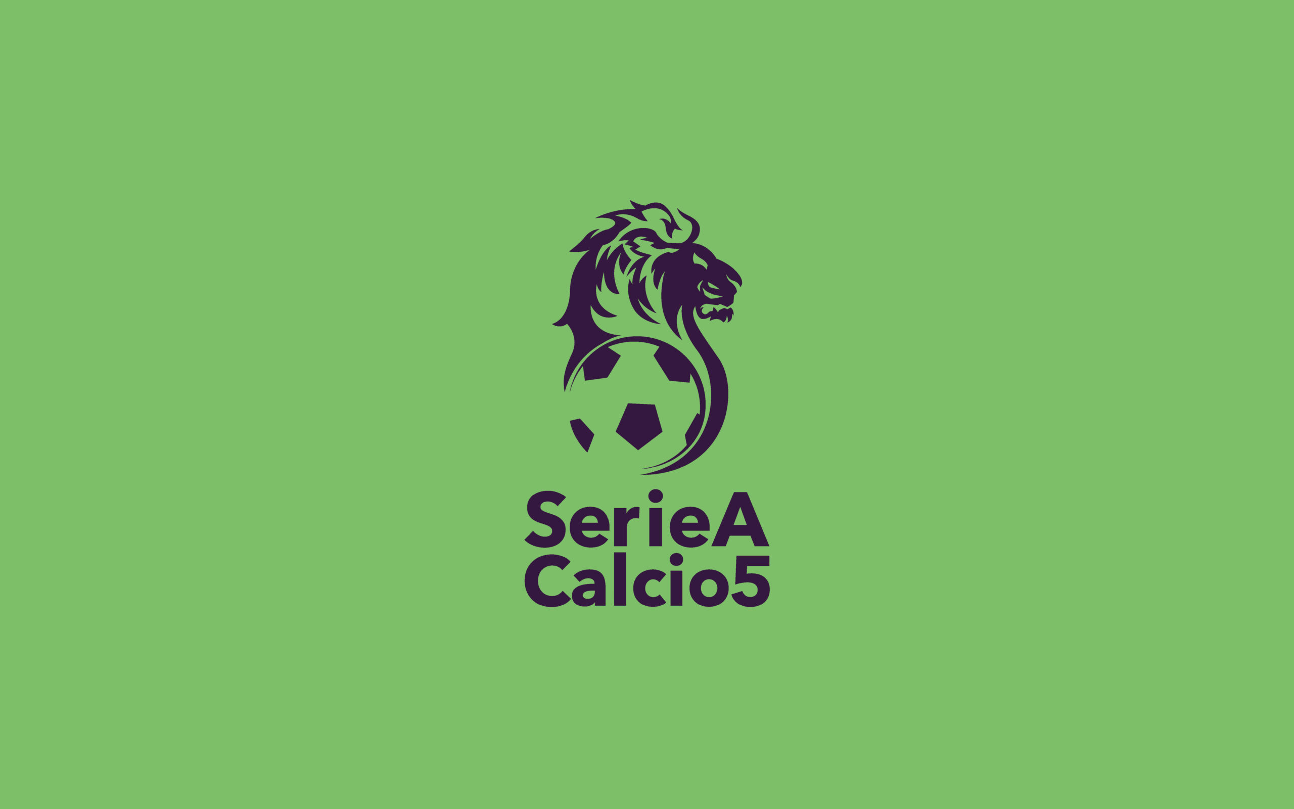
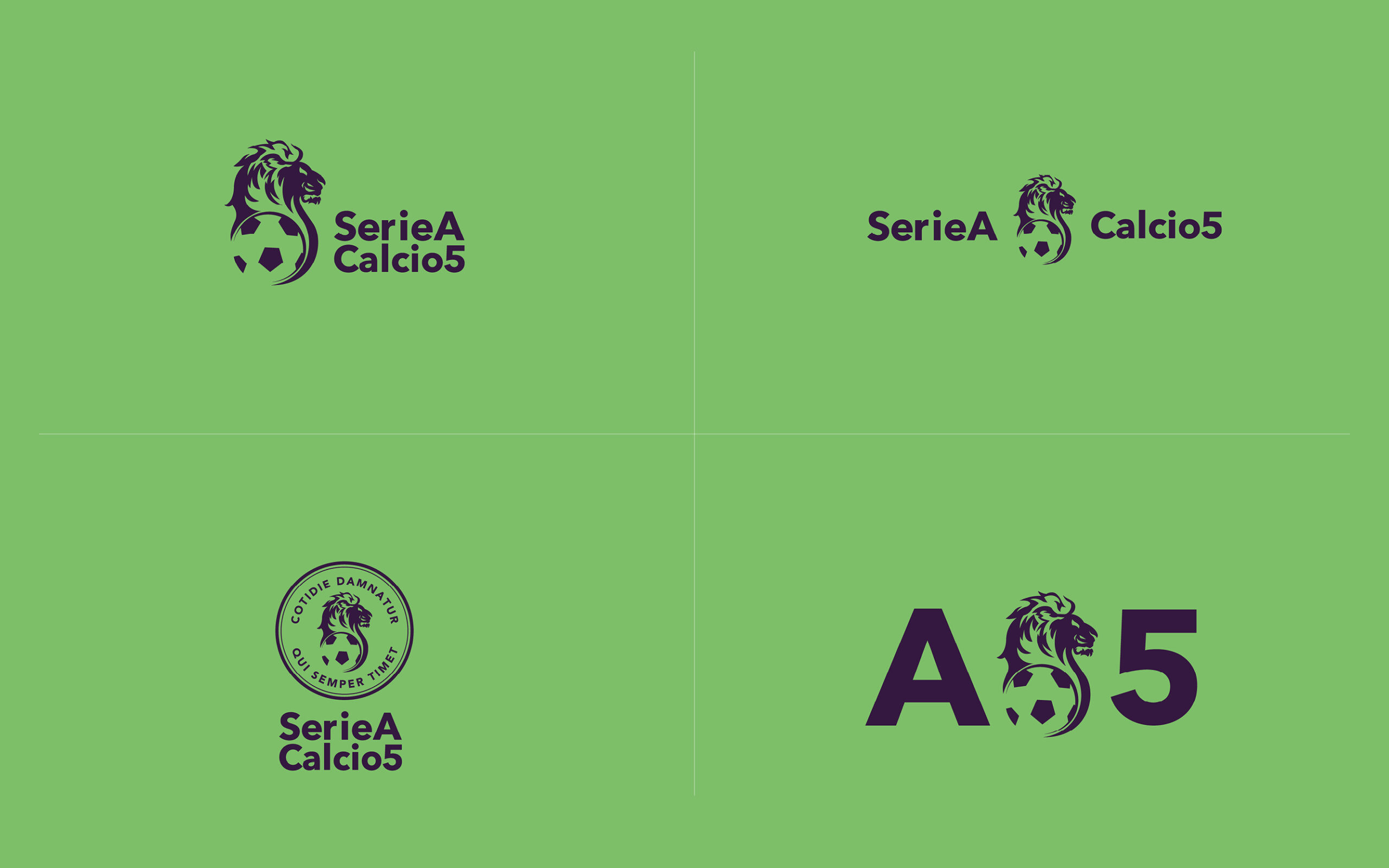
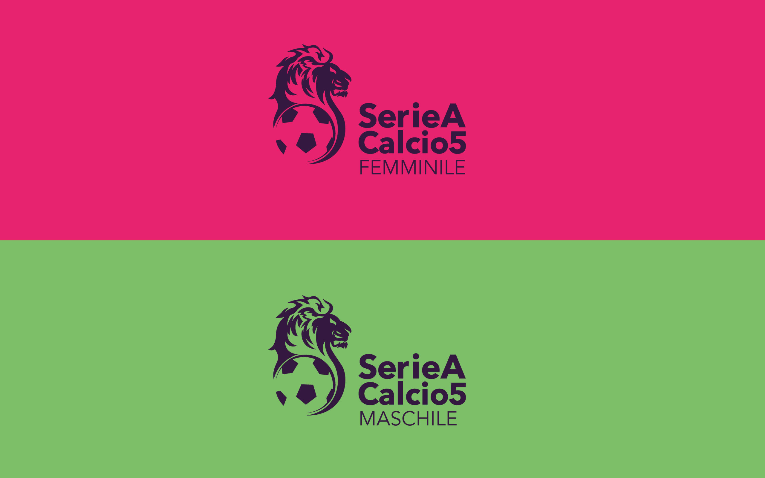
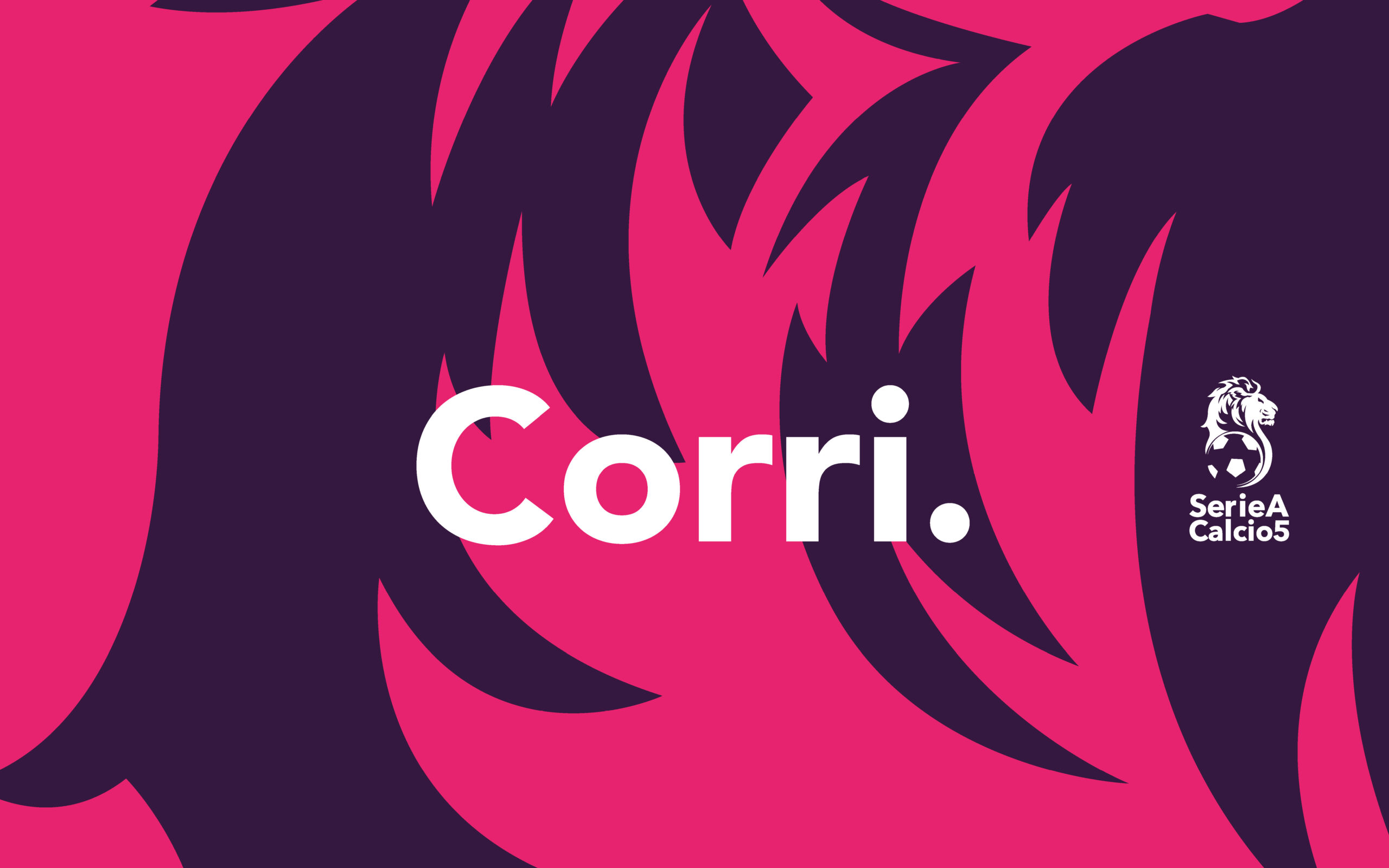
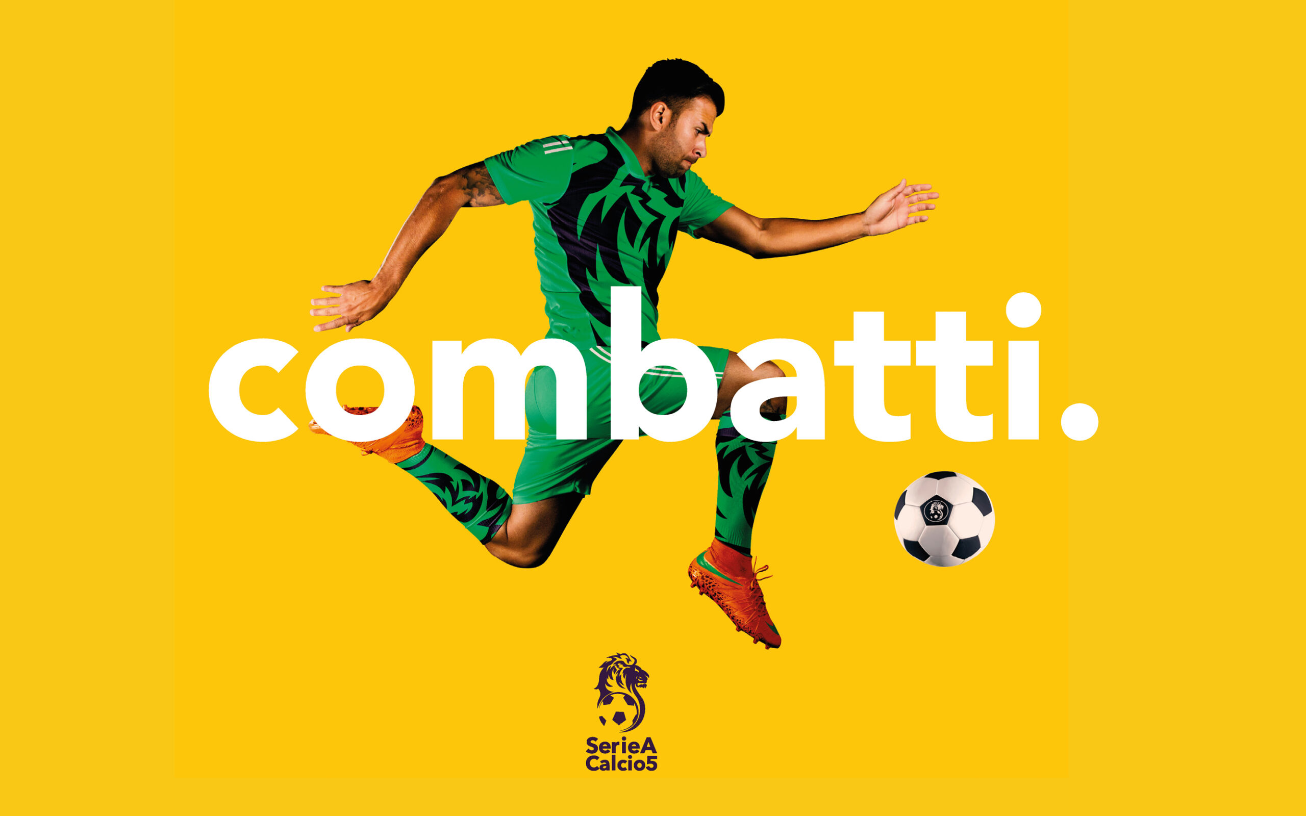
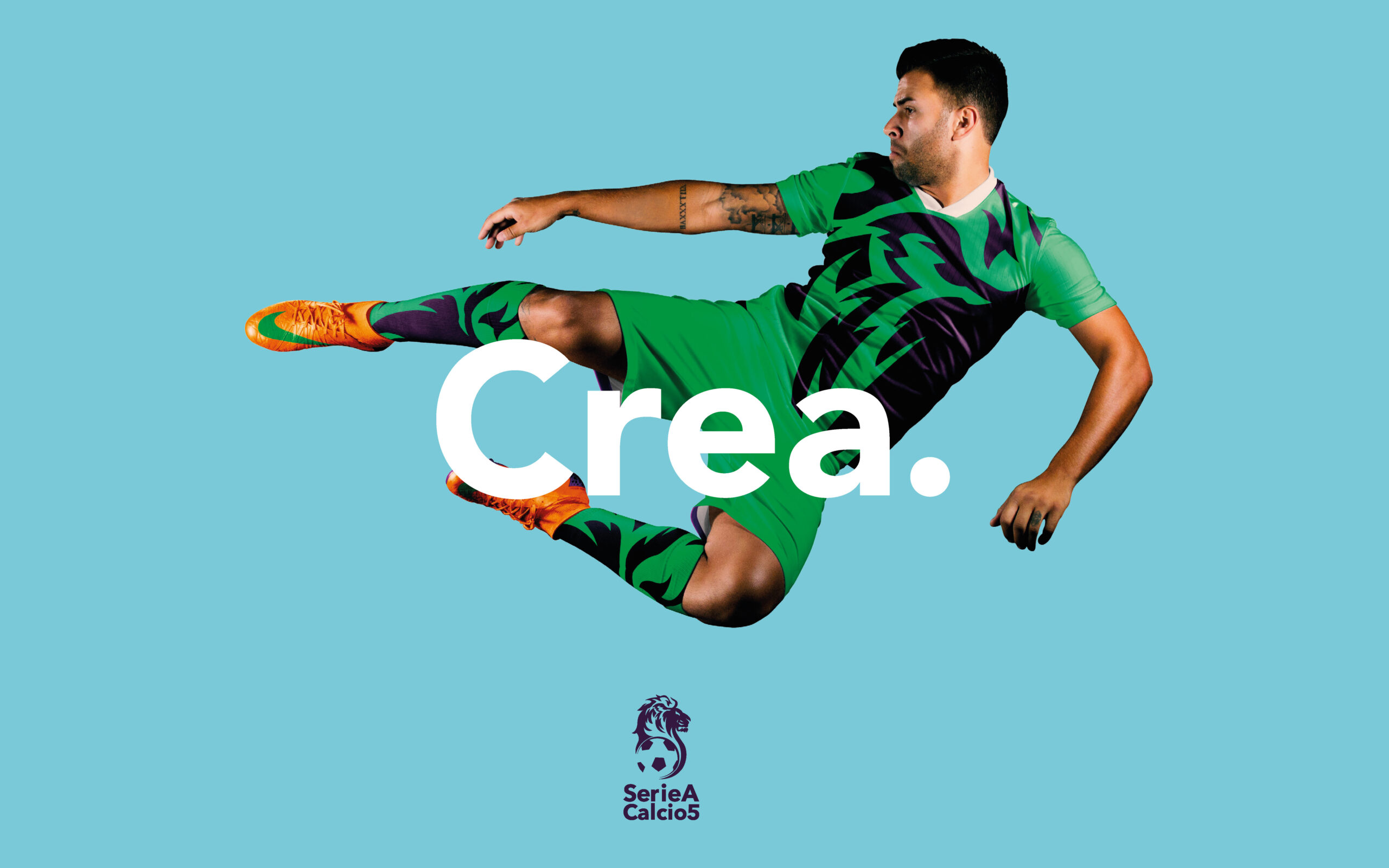
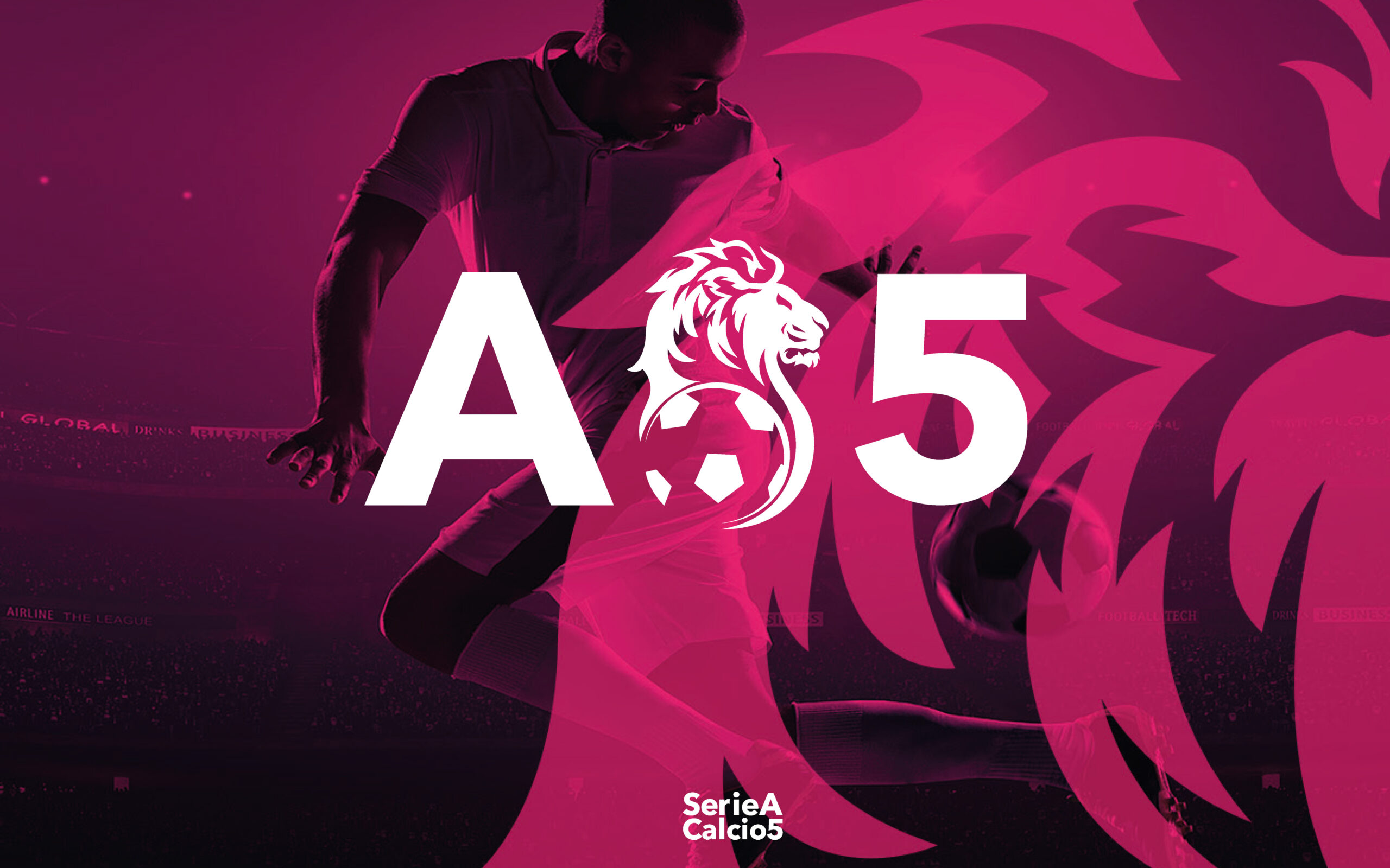
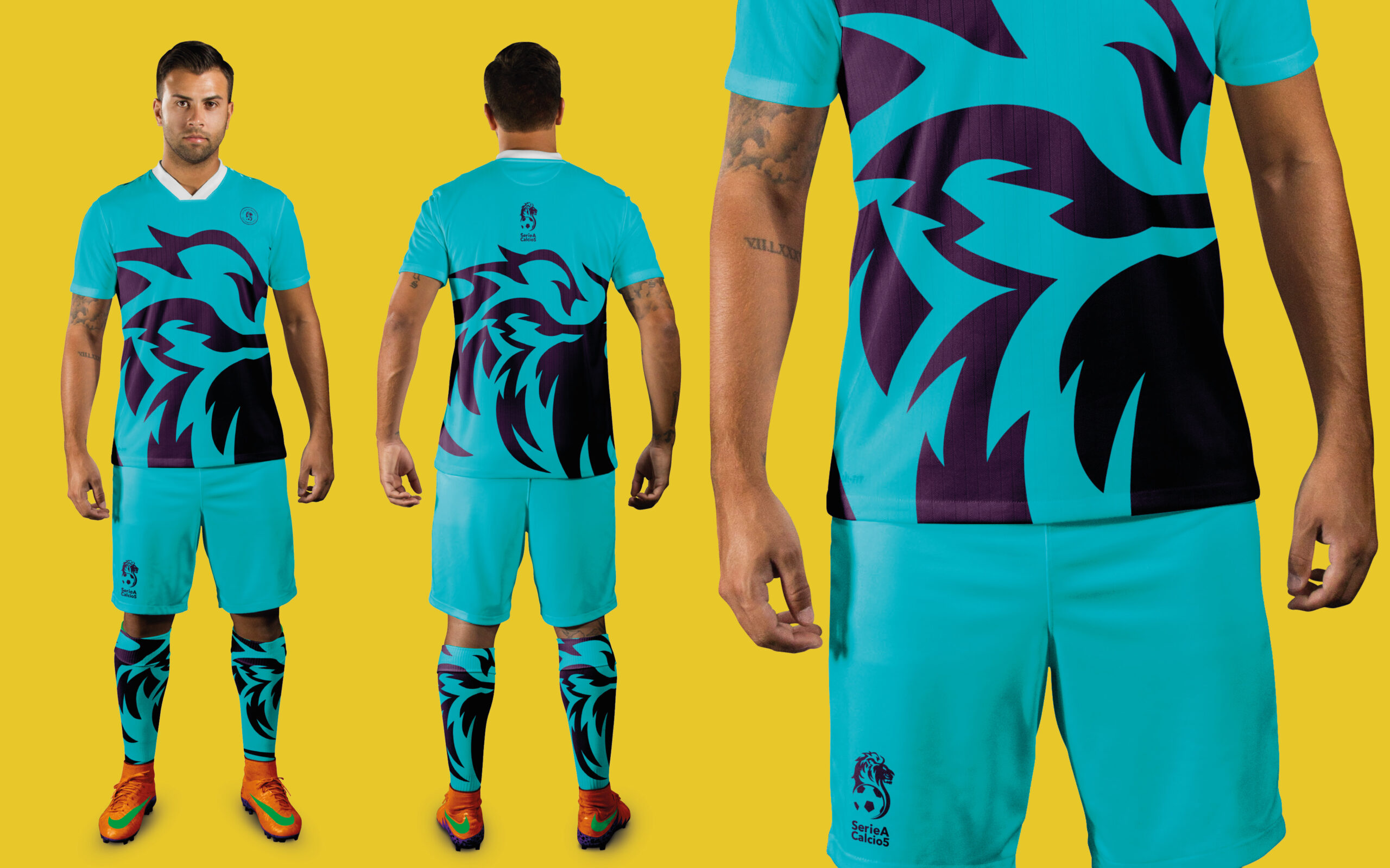
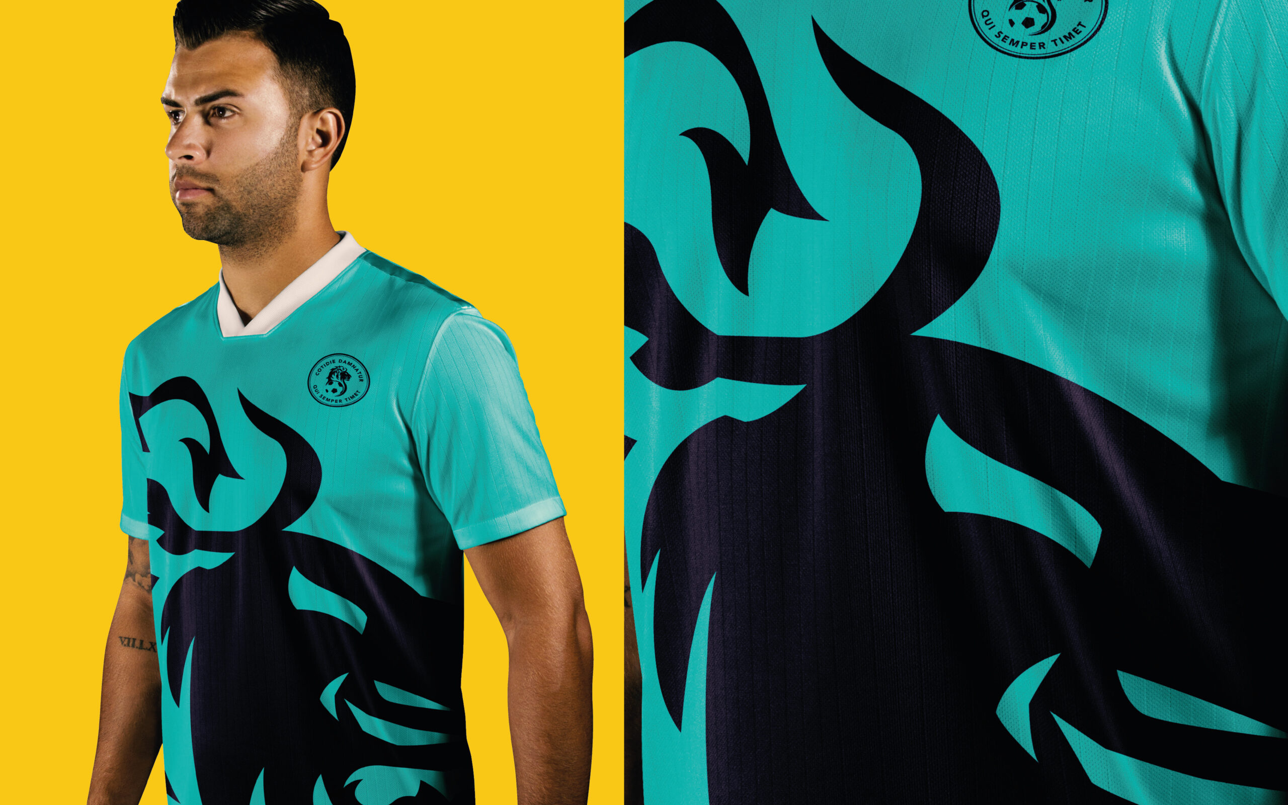
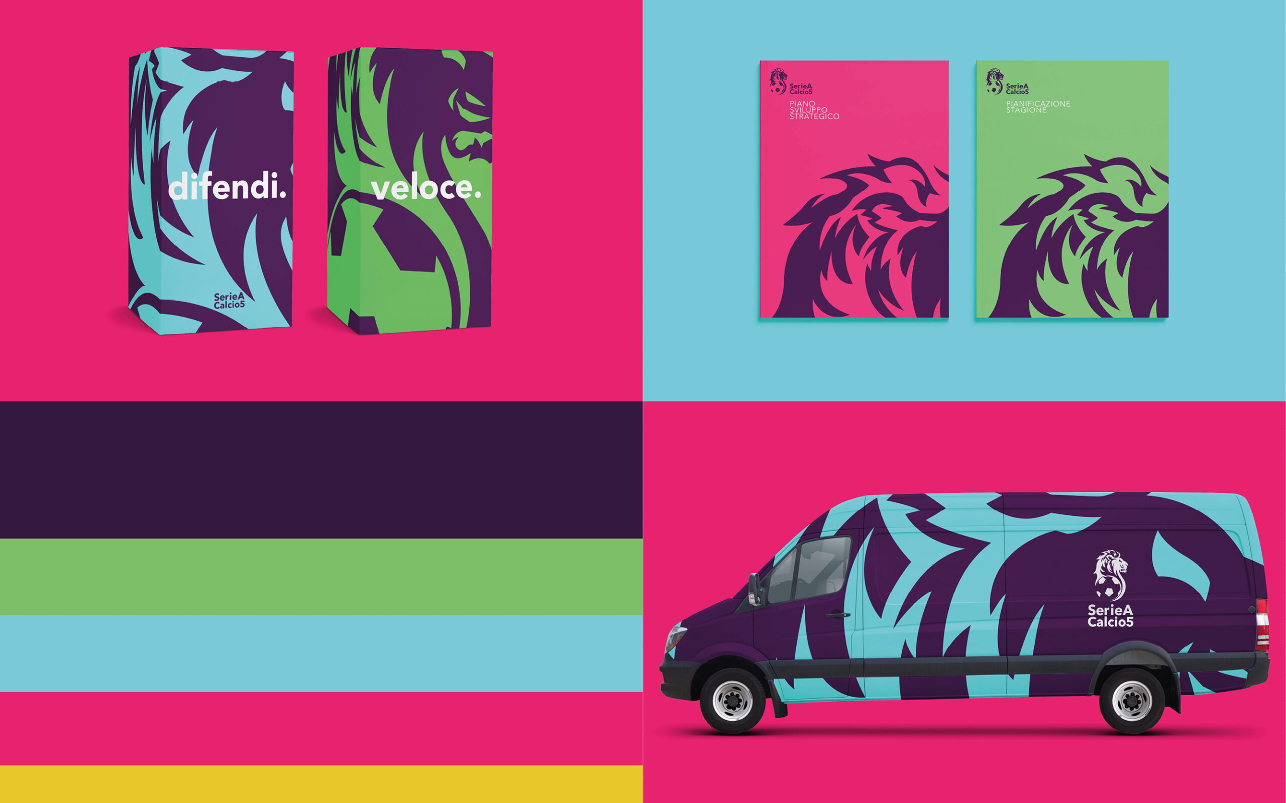
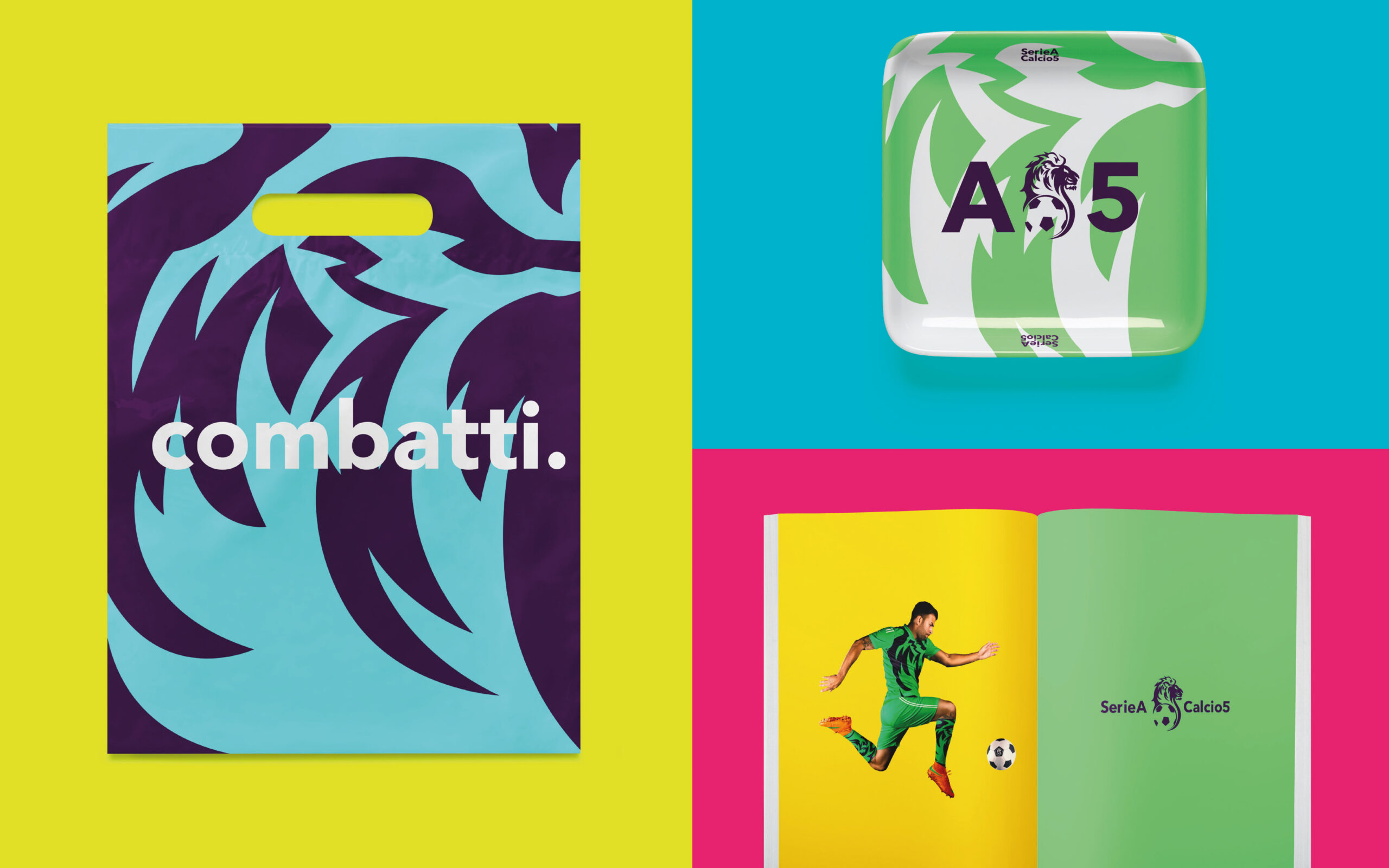
The visual language for “Lega A5” is characterized by bold, vibrant colors and a dynamic lion motif that signifies strength and competitiveness. The use of fluid lines and geometric shapes in the logo reflects the movement and energy of the sport, while the color palette – a mix of deep purples, bright greens, and other high-contrast hues – is designed to stand out in the competitive sports market.
The typeface chosen for the brand is modern and assertive, complementing the overall aesthetic and ensuring legibility across both digital platforms and physical merchandise.
ADL approached this challenge by delving into the history and culture of A5-side football, extracting key elements that could be reinterpreted in a modern context. ADL worked on creating a logo that captures the essence of the sport – its intensity, agility, and distinct style. The construction phase of the rebranding included the creation of a series of prototypes for the logo, typography, color schemes, and additional visual elements.
Each iteration was meticulously evaluated to ensure it not only aligned with the project’s objectives but also maintained functionality across various applications.