Art Direction, Branding

Fondazione De Sanctis

Uniting tradition and innovation in cultural excellence

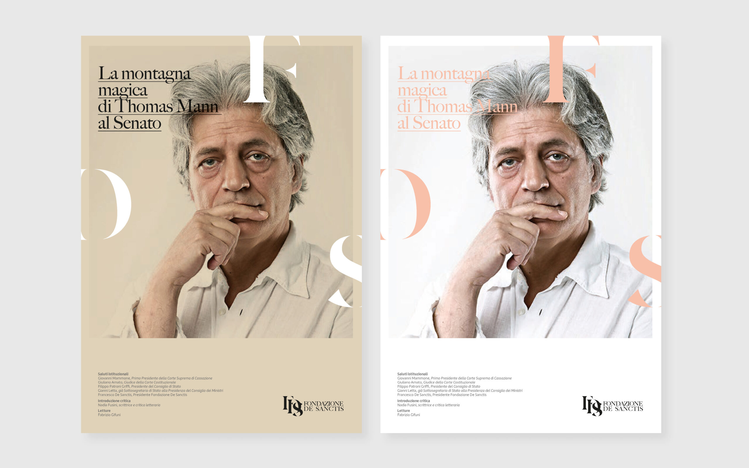
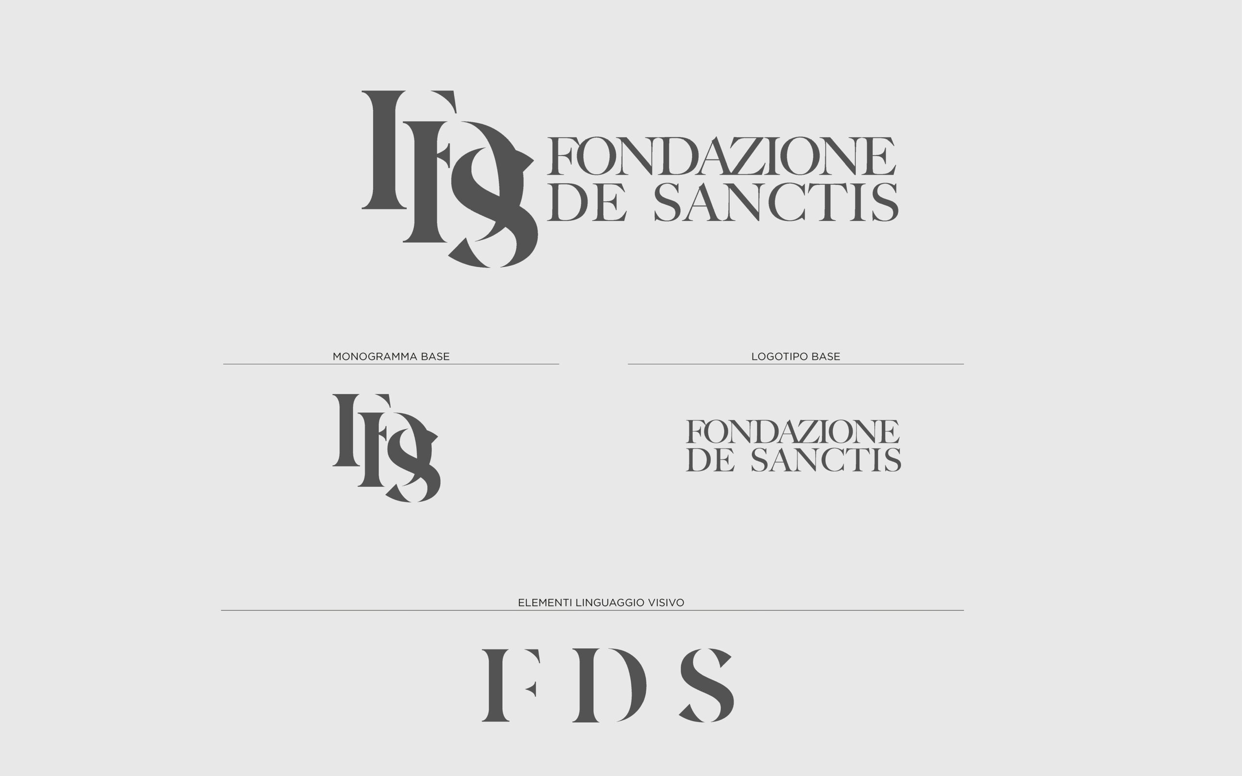
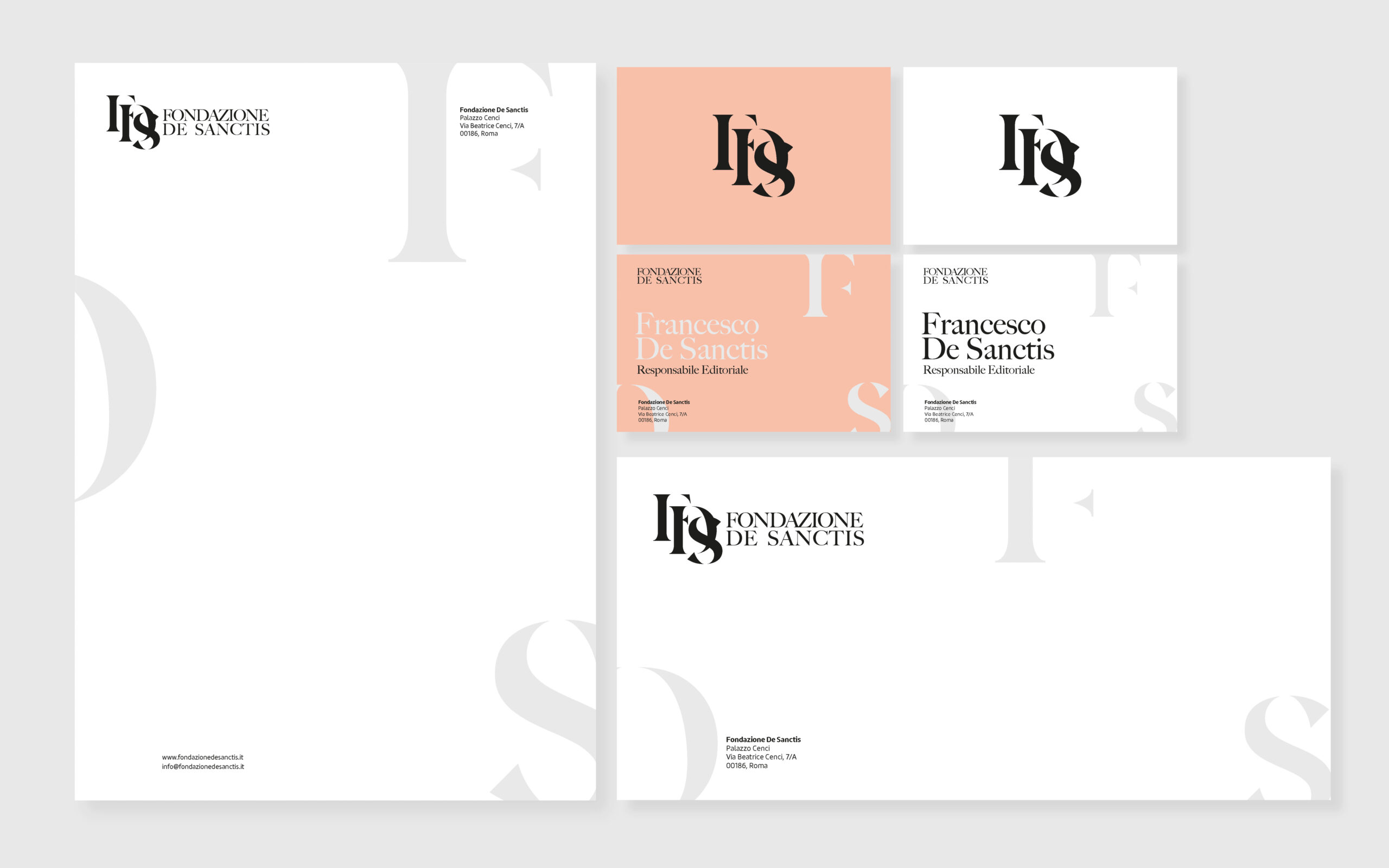
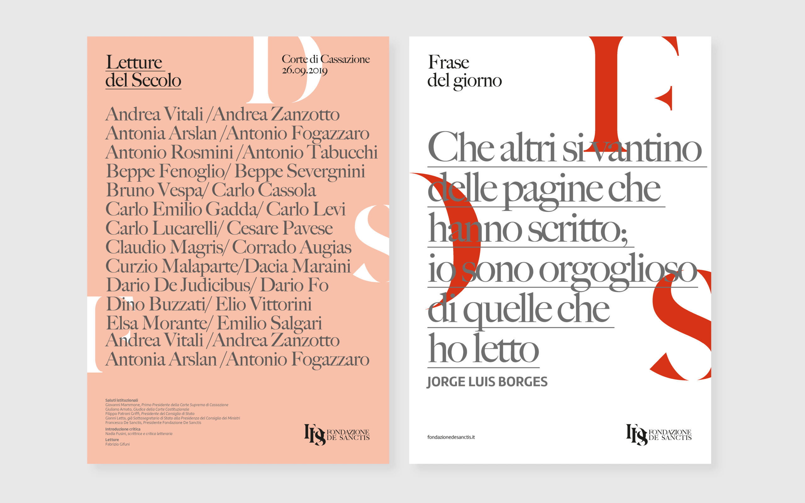
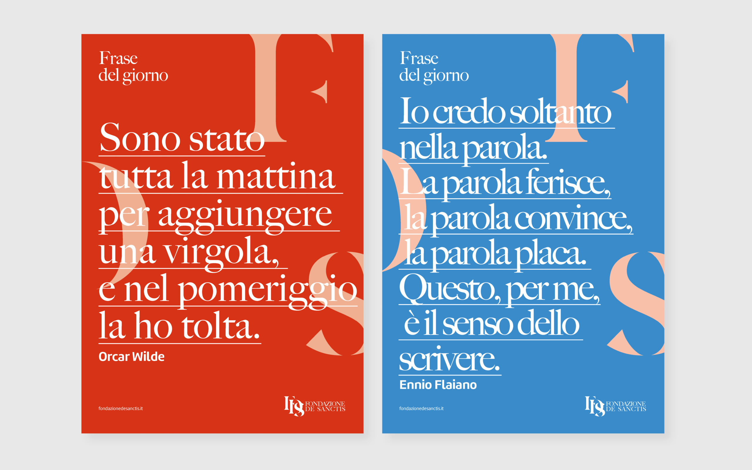
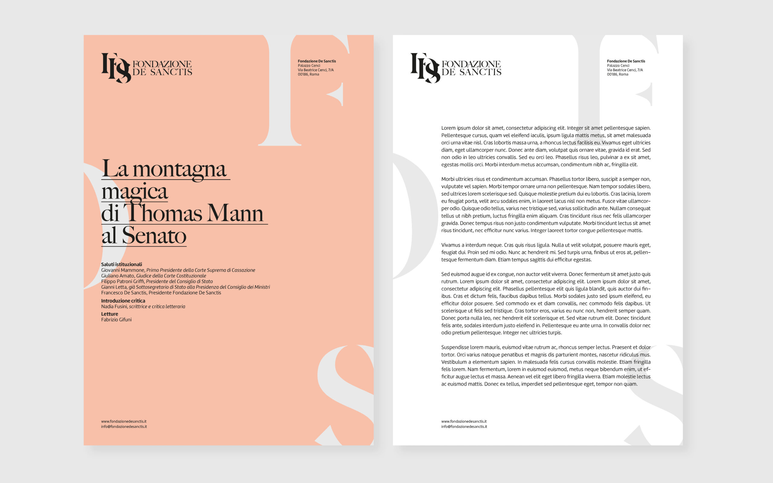
The Fondazione De Sanctis design project was entrusted with the task of creating a visual identity that both honors the foundation’s storied past and ushers it into the future. With a legacy deeply rooted in the cultural and literary landscapes, the foundation sought a visual language that could encapsulate its essence, tradition, and commitment to cultural dissemination. The design needed to be timeless, bridging the gap between classic and contemporary aesthetics. It was crucial for the identity to stand as a symbol of the foundation’s authority in the cultural sector while being adaptable across various platforms, from print to digital. The primary objective was to establish a recognizable brand presence that would resonate with scholars, patrons, and the general public, reinforcing the foundation’s role as a beacon of cultural enlightenment.

Process

The design exploration began with an analysis of the foundation’s heritage, drawing inspiration from historical typography and iconography. The creative process involved sketching and refining a set of symbols and typographic styles that would resonate with the foundation’s core values of wisdom, stability, and continuity. The construction of the visual identity involved meticulous typographic adjustments, ensuring legibility and elegance. The chosen typefaces reflect a modern interpretation of classical styles, embodying the foundation’s dedication to maintaining the integrity of cultural heritage while embracing contemporary discourse.​

Timeless identity​

The visual language is characterized by a refined and elegant typographic approach, utilizing serif typefaces that exude classical charm. The color palette is restrained, featuring warm, earthy tones that evoke a sense of history and gravity.
The interplay of typography and negative space across the various applications suggests a balance between tradition and modernity. The logo, a stylized monogram, serves as the cornerstone of this visual language, representing the foundation’s initials in a way that is both authoritative and approachable.

©Copyright 2024. Acosta Design Lab. All rights reserved.